

Hegira Health, Inc.
An updated brochure and branding style guide for one of Michigan’s largest behavioral healthcare organizations
Visual Design,
Branding
Role
Platform
Web,
Marketing

Adobe Photoshop,
XD
Tools
Timeline
2 Weeks
About
HHI
Hegira Health, Inc. is one of Michigan's largest freestanding, integrated behavioral healthcare organizations, providing a wide variety of mental health and substance abuse treatment services to individuals of all ages. For over 50 years, their team has been committed to providing “quality, individualized, and rapidly accessible” care.
I believe healthcare should be accessible to everyone, regardless of income, so I was delighted to help HHI reach a broader audience by volunteering my design services through catchafire.org.

“Hegira means journey, and we are here to provide support along the journey of life.”
Project Plan
Objective: Provide consistency and coherence to HHI’s visual identity with a branding guide that lays out design choices such as colors, font styles, and graphics

Prepare Materials
• Director of Development provides current logo and branding guidelines, as well as any existing marketing/communications materials (letterhead, business cards, social media usage, etc.)
Brainstorm Ideas
• Discuss the branding goals, target audience, use cases and preferred design elements
• Agree on what should be covered in the visual branding guide
Draft Deliverables
• Update visual branding guidelines/ style guide and brochure
• Include mission statement, colors, fonts, correct logo usage, and custom graphic elements to be incorporated in future communications
Implement Feedback
• Prepare final version and provide materials in high-resolution formats for digital and print use

My Process
I follow a similar design process for every project (whether it’s UI/UX, web, branding, or general visual design) because the key steps in my process always apply, even if not always linear, while leaving room for the specific needs of each project outcome. In this case, my process paired with the project plan helped me map out the steps, giving a simple and clear outlook.

•Research
•Empathize
•Create
•Iterate
•Develop
Brochure Audit
Many of the services listed on the original brochure are redundant, taking up space on the brochure, so first I parsed through the information and grouped the services by whether they are offered to children, adults or both. This helped me to organize the information and identify what information can be omitted or grouped into a single section.


Next, I broke down the sections even further, and using the key, I highlighted services that could be grouped into new sections. This was to help me visualize the general layout of the abundance of services and information in a more cohesive way.


Initially, I had planned to redesign the brochure as a four-page pamphlet with an accordion fold, in order to fit all of the necessary information (there is a lot!). The original brochure was a booklet using two sheets of paper, but I figured that in order to conserve the amount and cost of paper, the brochure should be an easily-printable single sheet. Using my color-key system again, I broke the sections down by service.

After I started to set up the measurements for my workspace in Photoshop, I had a nagging thought that using the four-page pamphlet may not be the best solution. I was wondering how the brochure could be further simplified and use standard 8.5 x 11 inch printer paper, instead. I looked at some templates and ultimately decided to opt for a three-page pamphlet.
Front Side

Back Side

Feature Updates
The new brochure will be used at recruiting events, for client referrals and for sponsors and donors. For this reason, it includes lists of services and resources broken into easily-identifiable sections. Additionally, there is a more prominent “Contact” section including the main phone number, email and website, as well as social media. Because the intended use and purpose of this brochure is to provide a snapshot of what Hegira Health has to offer, simplifying a myriad of services listed on the original and organizing them in a way that is easier to navigate was of the utmost importance. Adding some imagery and a more stylized look helps to modernize the brochure and make a somewhat monotonous object a little more interesting.
Imagery

• Creates a more personal and welcoming aesthetic

Stylization
• Simple graphic elements add decorative/ interesting visuals without distracting from information


Contact Section
• A section dedicated to contact info, making it easier to find resources

• Single sheet of standard-size paper, accordion fold simplifies the design, is ideal for easy printing and use at events, ad well as for clients
Tri-fold Design


Before

After


Website Notes
In addition to the brochure, HHI needed an updated branding style guide as well. The Director of Development expressed interest in any tips or notes about how the website could have a more contemporary feel. I looked through the website on both my laptop and my mobile phone and took some notes before crafting a new style guide to address some of the style issues.
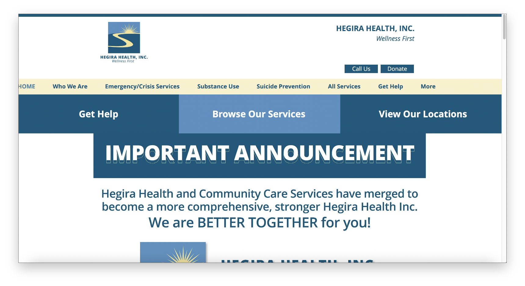

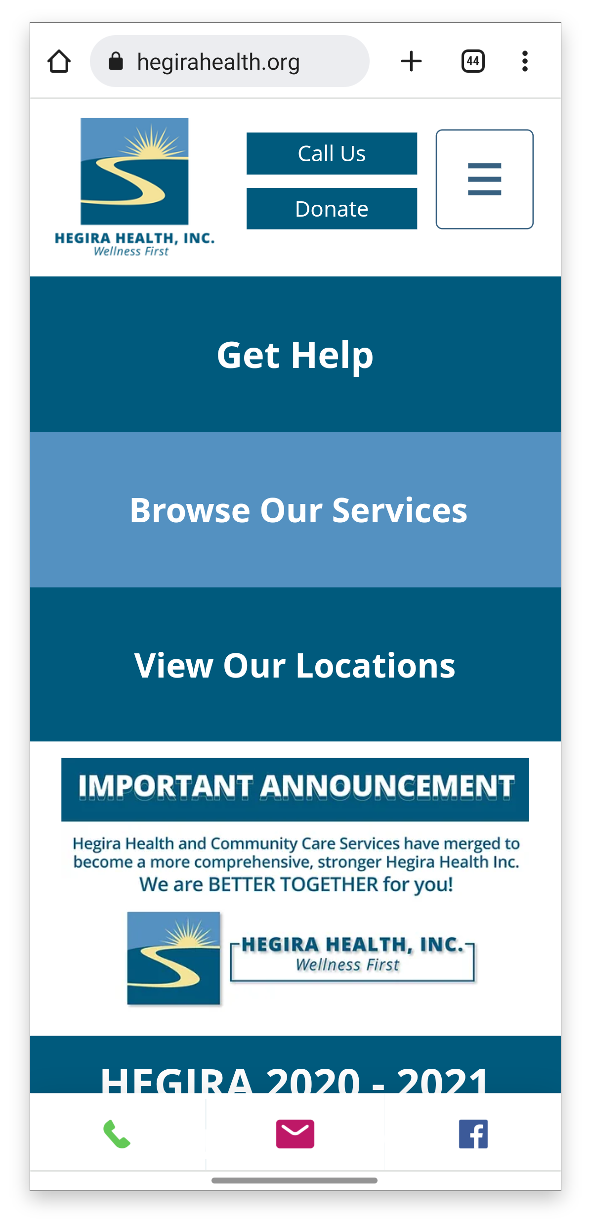
• Alignment issues with header, logo and navigation bar on larger screen sizes. The mobile version looks good, but some elements are not responsive.
*Edit padding and margins for varying screen sizes

• Very large text/ a lot of information on one page, causing user to have to scroll excessively. This example shows the “Wellness Talks” page
*Use smaller fonts sizes (see style guide), smaller video template and more selective information


• Varying button styles throughout the entire website is confusing and causes a sense of inconsistency. Some are rectangular, pill-shaped or rounded and are all different in the hover state.
*Use minimal and consistent button styles
Style Guide
I updated the existing style guide to include more specific details about typography, branding and messaging, imagery and new buttons and icons. The current website generally just feels dated and disorganized, but when the new style guide is applied consistently to the website, it will create a more modern feeling with increased ease of use.
Before

After

Takeaways

My process works for me
• As mentioned above, I usually follow the same basic design process, regardless of the type of project. Although it isn’t always linear and some steps need to be revisited, it gives me a solid framework in which I can brainstorm and design, while ensuring that I’m covering all my bases. For this project, I took a the most time organizing and editing the information to be included in the brochure. I feel that, especially considering the sensitive nature of the information included, the most important thing is that the information is accessible and easy to locate. Empathy for the needs of the target audience is always top priority.
I’m not afraid to rethink a decision
• After so much mapping out the initial four-page pamphlet design, and as confident as I was that it was the solution, I quickly realized that it wasn’t the best solution. I considered who may be printing and distributing the brochures- a printing company or a HHI employee? Who will benefit most from a more simplified design? Circling back and rethinking my decisions for something seemingly as trivial as how many pages the brochure should have was actually a pretty important step. Small details like that add up and define the overall experience for the end user.
I take pride in my work
• I was really excited to take on this project because although designing something for the healthcare industry can feel mundane or monotonous, it was a fun challenge to find a way to make a design that is both visually interesting AND contains all necessary (and potentially lifesaving) information. I would have loved to dive further into the website and do a complete redesign from a UI/UX design perspective.
*This project is in progress while Hegira Health, Inc. maps out its plan for a full update of its website and marketing materials. If you’re interested in learning more, check back here for updates about my involvement in the update and at hegirahealth.org. Thank you for reading!